Hey so if you want to increase your profits, the best thing you can do is optimize your landers/offers pages… I’ve did some really deep research and used like 5 different AI’s to crawl the internet and find every CRO tip and trick on Reddit, forums, inside books, youtube videos, comments and how to guides. Here’s the check list on how to get the most out of your landing page when it comes to conversation rate optimization. What I like to do is to create a lander, then tell the AI i’m using to make sure all of these tips are addressed in the lander… (for me atm, manus.im and lovable AI is doing the best job in making landers)
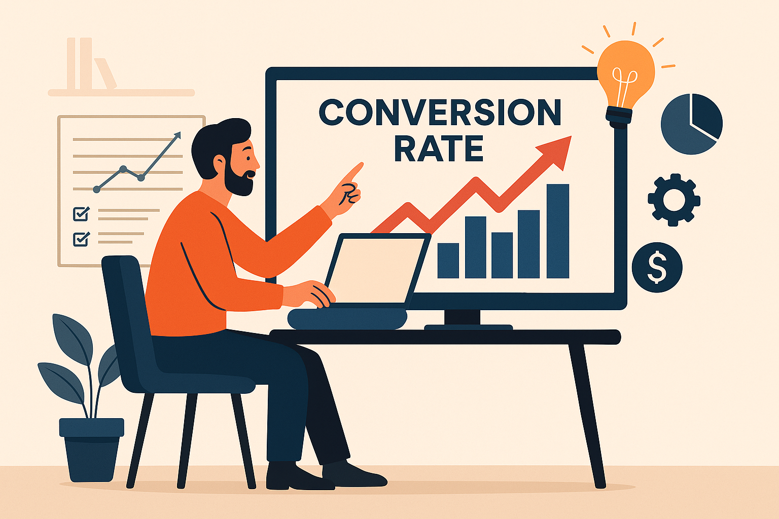
Here’s the check list to get the best CRO score…
1. Offer & Perceived Value
- Stack bonuses with visible dollar values: “Includes $179 in bonus templates and guides.”
- Show total value vs. today’s price: “$497 total value, yours for $49 today.”
- Give a believable reason for the discount: Mention a product launch, clearance, or annual promo.
- Offer a limited-time bonus or exclusive add-on: “Free 1-on-1 onboarding this week only.”
- Show value multipliers: “Lifetime access,” “Instant delivery,” “No recurring fees.”
- Use scarcity carefully: “Only 23 licenses left” or “Enrollment closes Friday.”
- Use authentic countdown timers: Tie them to real deadlines, not endless loops.
- Show crossed-out pricing: Original vs. current price creates strong contrast.
- Offer flexible payments: “3 payments of $33” often reduces hesitation.
- Include free shipping or handling: Simplifies perception of cost.
2. Copy & Messaging
- Lead with a “problem → promise” headline: “Still wasting hours on manual reports? Automate it in minutes.”
- Focus on one transformation: “Go from inbox chaos to clarity in one afternoon.”
- Use relatable emotional triggers: security, freedom, confidence, control.
- Add curiosity in subheadlines: “Most business owners overlook this simple 3-minute fix.”
- Keep paragraphs short: White space improves reading flow.
- Highlight specific proof: “Over 25,000 users switched in the last 90 days.”
- Repeat CTAs often: Every 1–2 scrolls or section breaks.
- Write CTAs in first person: “Start My Free Trial,” “Get My Quote.”
- Focus on benefits over features: “Save two hours a day” beats “Includes time-tracking dashboard.”
- Use micro-stories: Sprinkle short customer wins or use cases throughout.
3. Proof & Trust
- Show real testimonials with photos or initials: Adds authenticity and human connection.
- Display user numbers or achievements: “Trusted by 300,000+ professionals.”
- Include verified ratings or snippets: Even a few stars or short reviews help.
- Add trust badges: SSL, PayPal, Visa, Stripe icons reinforce safety.
- Make refund and support info visible: “30-Day Guarantee, support@yourbrand.com.”
- Add ‘As Seen In’ or partner logos: Borrow credibility where possible.
- Show legitimacy near checkout: Include contact info or certifications.
- Add timestamps or activity blurbs: “Samantha from Denver just ordered.”
4. Design & Visual Hierarchy
- Keep the primary CTA above the fold: Users should know the next step immediately.
- Remove distractions: Hide menus or irrelevant links on key pages.
- Use one button color consistently: Train visitors to recognize the conversion action.
- Show the product or result visually: Mockups, screenshots, or before/after visuals.
- Use directional cues: Arrows, lines, or faces looking toward your CTA.
- Break long text: Icons, bullets, and highlights keep pages scannable.
- Design mobile-first: Prioritize large tap areas and shorter text blocks.
- Ensure fast loading: Under two seconds is ideal.
- Add sticky CTA bars on mobile: Keeps the action button visible at all times.
- Use high contrast: Improves readability and subconscious trust.
5. Urgency & Scarcity
- Show stock or seat counters: Tie to real inventory or events.
- Add real countdown timers: “Offer ends in 2 days.”
- Use date-based urgency: “Enrollment closes Sunday night.”
- Include disappearing bonuses: “Bonus training available until midnight.”
- Use gentle urgency phrases: “Don’t miss this opportunity.”
- Keep it honest: Fake scarcity destroys trust.
6. Guarantees & Risk Reversal
- Show a bold money-back guarantee: “Try it for 30 days, love it or get a full refund.”
- Use confident language: “We’ll refund every penny, no questions asked.”
- Add reassurance near CTAs: “100% secure checkout. No hidden fees.”
- Include lock icons or security seals: Reinforces confidence in the transaction.
7. Engagement & Personalization
- Add localized or personalized touches: “Join 2,300 members in your state.”
- Address different personas: “For freelancers, agencies, and startups.”
- Use interactive tools: Quizzes, calculators, or short checklists boost engagement.
- Offer previews or trial options: “Try before you buy” reduces hesitation.
- Show exit-intent popups: Offer smaller lead magnets or discounts before exit.
- Behavior-based personalization: “Welcome back, ready to continue?”
- Gamify progress: “You’re 80% done—finish your setup!”
8. Post-Purchase & Continuity
- Optimize your thank-you page: Confirm purchase and explain what’s next.
- Offer relevant upsells or add-ons: “Add lifetime updates for $9.”
- Invite customers to your community: Private groups build retention.
- Show a delivery roadmap: “Day 1: Access. Day 2: Bonus unlocks.”
- Encourage referrals: “Share with a friend and earn credit.”
- Use onboarding or nurture emails: Help new users see quick wins.
9. Data, Testing & Analytics
- Use visual analytics tools: Hotjar, Microsoft Clarity, or session recordings.
- A/B test core elements: Headlines, hero image, CTA text, button placement.
- Focus on single-offer pages: Avoid competing CTAs.
- Test pricing anchors: $9.95 vs $19.95 vs $29.95.
- Track all key events: Add to cart, form start, purchase completion.
- Use funnel analysis: Identify exact drop-off points.
- Run cohort comparisons: Segment by device, traffic source, or region.
- Ensure accurate attribution: Keep tracking consistent across platforms.
- Reach statistical significance before calling results: Don’t trust small sample wins.
- Prioritize with the PIE model: Potential, Importance, Ease.
10. Continuous Optimization & Improvement
- Audit performance regularly: Check load times, UX friction, and analytics setup.
- Study competitors: Borrow what works, improve what doesn’t.
- Map customer journeys: Understand their full experience from first click to purchase.
- Keep generating test ideas: CRO is never “done.”
- Test across devices: Guarantee consistency everywhere.
- Collect feedback: Post-purchase surveys reveal hidden friction points.
- Refresh visuals periodically: Keep your offer feeling alive and current.
The Big Picture
Every CRO element here supports three universal goals:
- Reduce friction – Make it effortless to take the next step.
- Increase motivation – Highlight emotional and tangible rewards.
- Build trust – Prove you’re credible, secure, and worth believing in.
Combine these across your copy, design, and analytics, and you’ll create a system that not only converts more visitors but also deepens customer loyalty over time.

